More than
1,000 Mobile
Templates in Our Library!
No other firm can provide their clients with so
many great options when it comes to building
high quality & professional-looking websites


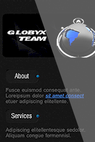


Mobile Website Designs
With the monumental increase in the number of mobile phone users
that access the internet, it's important for website owners to get a
mobile version for their website. Without proper design, mobile
websites tend to appear jumbled up or are very difficult to navigate
through. When you try opening a website on your Blackberry, iPhone,
Android, Nokia or any other mobile phone that you use you will see
that the experience of browsing your site is not the same, when
viewed on a Desktop or a Laptop.
This can cause site users
to go to another, easy-to-load site, especially when they pay their
internet provider by how much data they use. When people surf the
web via a mobile device, they typically want to quickly access
information that is to the point and contact information that is
easily accessed.
The
Mobilization Movement
There are more than 2.5
billion mobile phone users worldwide and a thousand more added every
minute. Approximately 30% of mobile phone owners around the globe
have browsed the Internet using their mobile phones. For this reason
mobile browsing is speculated to become the next predominant
platform for internet use. For many customer service oriented
companies, having a mobile website is a requisite rather than
something that's considered nice to have. Many experts anticipate an
exponential growth of mobile phone users for years to come. Here are
some statistics:
- Since 2010 mobile web search has increased
by four times.
- By 2013 mobile web surfers are expected to be
more than desktop/laptop users
- It's estimated that by 2015 every
individual will have a mobile phone
- 60% of people expect a
mobile web site to open in 3 seconds or less
- 70% of people have
done price comparison of different products on their mobile phones
- 95% of people have searched for local information on their smart
phones
- 79% of people have used mobile devices to read product
reviews
- 57% of people would not recommend a company with a bad mobile site
Businesses and organizations need to consider the effects the mobilization movement could have on their business. Looking at the escalation of web browsing activities as well as the anticipated growth, businesses need to make sure that their websites are compatible with mobile browsers so they don't get left behind on the mobilization era. If your website isn't compatible for mobile phone browsers, you should think of modifying your site to keep up with the growing population of mobile web savvy users.
How First Digital Can Help
When designing a mobile version of your “regular” website, we always take into consideration the user experience. With a regular site it's common to have lots of text, images, links, forms and even Flash. However viewing regular sites on a mobile device can be frustrating for the mobile user.
At First Digital we provide progressive mobile web design services to help you reach your target audience as well as future audiences. The mobile version of the website we design has the following features:
- An original
mobile design that compliments your regular site
- User-friendly
navigation
- Easily accessed from various phone browsers such as
Blackberry, iPhone, Android and Nokia
- Can be accessed on a variety of browser dimensions (128 x 160 pixels, 176 x 220 pixels, 240 x 320 pixels and 320 x 480 pixels)
Long load times, lots of
scrolling as well as enlarging and reducing in order to navigate are
some of the frustrations people endure while using websites that
have not been optimized for mobile phones. This often causes mobile
users to go to another site that's easier to load. Especially when
they pay their provider based off how much data they use. When
people surf the web using a mobile device, it's because they want to
access information quickly.